From Legacy CAD to Modern UX
BricsCAD
Working at Bricsys for seven years, I played a key role in the ongoing evolution of BricsCAD’s user experience and interface design. The challenge was unique: bringing a long-established, feature-rich CAD platform into the modern era, while respecting the habits and expectations of its loyal user base.
Our goal was to modernize BricsCAD’s interface without breaking familiarity. Many users had been working with CAD tools for decades, so every change had to feel purposeful and intuitive. At the same time, we wanted new users to feel confident and welcome from their very first interaction.
I worked closely with developers, product managers and user researchers to design a clean, cohesive, and accessible UI, built on a refreshed and optimized codebase. This meant revisiting everything from layout and iconography to color, contrast, and overall hierarchy, ensuring that the design looked refined while performing efficiently on Windows, Mac and Linux.
Throughout the project, we walked a careful line between innovation and familiarity. We introduced new features, modern visuals and improved usability, while keeping full API compatibility and a seamless experience for existing workflows.
The result was a product that felt familiar to long-time users, yet visually and functionally aligned with modern design standards. BricsCAD became not only more powerful, but more enjoyable to use — an interface that reflected the same quality and precision as the tools it enabled.
Key Design Areas

Improved Launcher


The First Point of Contact for New Users
Through user testing and research, I discovered that many new users were landing in the wrong workspace or even the wrong product for their needs.
We focused on improving this first point of contact by guiding both first-time and returning users into the right workspace from the start. The goal was to create a smoother onboarding experience, helping users feel confident and productive within minutes.

Guided Tips and Tricks
Onboarding Challenges
During onboarding, we identified two key challenges:
-
Legacy users migrating from AutoCAD often struggled with some of the software-specific differences in BricsCAD.
-
New CAD users felt overwhelmed by the amount of tools and options available.
To address both, we designed interactive in-product tutorials and an animated, navigable Tips Panel. These guided users through essential tools, introduced unique BricsCAD features, and helped them build confidence step by step.
The result was a smoother onboarding experience that supported both experienced CAD professionals and complete beginners, while also highlighting the strengths that set BricsCAD apart.

Intuitive Settings
Visual Feedback
One of BricsCAD’s greatest strengths is its full customizability. This flexibility is essential for third-party application developers, as around one-third of users run additional plug-ins or custom scripts on top of the standard product.
However, the settings dialog was complex and difficult to navigate, especially for users without programming experience.
We redesigned the interface into a tabbed, intuitive settings dialog that made configuration easier to understand and manage. The advanced tab preserved all of the original options for legacy users, while a new visual layer allowed others to see their changes reflected directly in the program.
This update made the system both developer-friendly and accessible, improving usability without compromising the power and flexibility that BricsCAD is known for.
LookFrom Navigation Widget
A Modern First Impression for New and Returning Users
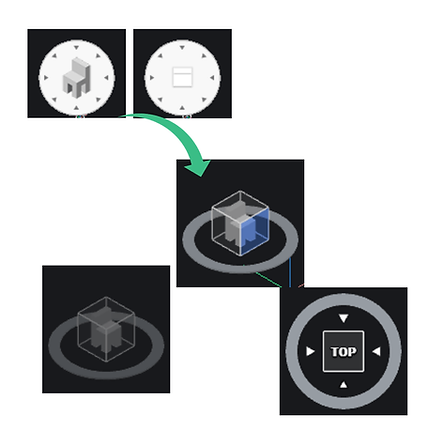
First impressions matter. One of the first elements users encountered in BricsCAD was the LookFrom navigation widget. It looked pixelated, felt outdated, and was unintuitive for new users. Even worse, a long-standing bug caused it to follow Mac users across their screens, even when BricsCAD wasn’t active.
We completely reimagined the widget to create a clean, modern design that worked equally well in both 2D and 3D environments. The new version maintained full functionality, stayed within patent boundaries, and offered a smoother, more professional first interaction for every user.

Visual Status Bar
Balancing Modern Design with User Flexibility
Another key first point of contact for users was the status bar. Compared to competitors, BricsCAD’s version felt "clunky and outdated".
Through user research and testing, we discovered that many users actually disliked the icon-only status bars found in other CAD software. This insight gave us an opportunity to create something better!
We redesigned the status bar with optional text labels alongside the icons, improving clarity and accessibility. When screen space was limited, the text would automatically collapse, leaving only the icons visible. This approach gave users the best of both worlds.
Sandbox Environment
Testing New Features in Real-World Conditions
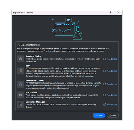
This request came directly from developers and product owners who needed a way to test workflows and proof-of-concepts in real-world scenarios outside the short beta window.
The solution: a Sandbox Environment, introduced as the “Experimental Features” mode. Any user could enable it to try out upcoming tools and functionalities that were not yet ready for full release but showed potential value.
This setup provided a vital feedback loop between users and the development team. By gathering insights from real-world testing before the final release, we could refine features early, a critical step for iteration within a waterfall environment.
Focus Areas
Provide a general description of the items below and introduce the services you offer. Click on the text box to edit the content.
User Experience Design
Improving usability without disrupting established workflows
Accessibility and Consistency
Ensuring clear navigation and predictable interaction patterns
User Interface Redesign
Creating a modern, cohesive look across the platform
Cross-Team Collaboration
Working closely with engineering and product to maintain performance and API stability
Legacy Software Modernization
Evolving a mature product with thousands of long-time users
Multi-Platform Support
Ensuring stability and consitency across Windows, Mac and Linux OS